Microsoft kicks Calibri to the curb for Aptos as default font
The artist formerly known as Bierstadt

Haters of official Microsoft Office font Calibri finally have their wish – the infuriatingly 11-point default typeface has been chucked to the bin in favor of Aptos, the new official font to be used in all the Microsoft Office apps.
For font nerds, Aptos is the static font formerly known as Bierstadt, part of the same neo-grotesque* sans serif tradition as Helvetica, and it was picked from the five fonts commissioned by Microsoft to replace Calibri in 2021.
Sans serif means without the curly bits and bobs – aka serifs – that some typefaces have. But in news that might disappoint the borough of the German city of Wiesbaden, or its original namesake, a 14,000 ft peak in Colorado's Rocky Mountain range, Bierstadt (BeerTown) has been renamed by its designer as Aptos, perhaps in an effort to separate techies from cold beer, or perhaps to pull focus nearer to California, where the Santa Cruz town Aptos is located.
Microsoft principal program manager Si Daniels said in the announcement post that Aptos was chosen from the five contenders over two years after "our search for the perfect font for higher resolution screens began. The font needed to have sharpness, uniformity, and be great for display type."
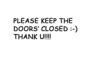
Through the years, Calibri utilized Microsoft sub-pixel font-rendering display technology Cleartype, neat software trickery that won't stand up to today's 4K screens. It has even been cited as evidence in a fraud investigation into former Pakistani prime minister Nawaz Sharif during the fallout of the Panama Papers leaks – supposedly to show a certain document could not have been written before 2007. And it has its detractors, among them a Reddit poster who hilariously seethed: "Look I understand if you have a staff shortage and you have to let people know [about it] at your Coffee 1 coffee shop, so you make a sign. But it would be well worth the effort to change from the default font in Word or Publisher to Arial."
Who does the font change affect? Well, millions of people really. Microsoft said last year it had over 345 million paid seats on Office 365, and many of those users wouldn't think to bother to change the default 11-point Calibri text (that's about 0.15 inches, or 3.88mm tall – just ever so slightly shorter than essay type, and a point or two bigger than newsprint. The Financial Times uses type set at around 8 points, while NYT is closer to 9).

Microsoft posted this image on the Medium post announcing the new addition
And for a mere font, Aptos has some quite useful features besides the really subjective look and feel stuff.
First, its lowercase l has a distinctive tail, separating it from the capital I. Also, 6 is single stroked while two piled ellipticals make 8 – helpful for those of us with stronger prescriptions. On a more ephemeral note (break out the incense) the software vendor also claimed the font had a more "humanist" touch as it had to "induce trust." Who needs faultless patches and updates to win trust, amirite?
Microsoft's Daniels said in the post that Aptos would start appearing as the new default font across Word, Outlook, PowerPoint and Excel for hundreds of millions of users from yesterday, adding: "And, over the next few months, it will roll out to be the default for all our customers."
Commenters across the media spectrum were mostly positive on the change, although some bemoaned that there were no updates to Chinese, Japanese, and Korean languages, with @kisaragi_hiu complaining that users were "still stuck with the PMingLiU / SimSun / MS Gothic set."
The losers? The other contenders were Tenorite, Skeena, Grandview, Seaford … but they'll stay on the drop-down menu, along with Calibri and good old Arial.
Aptos was designed by Steve Matteson, who also designed Segoe, the font of the Windows 11 system UI, as well as all of Windows' TrueType core fonts.
The Register tried to drag a few graphic designers away from their luxury Adobe SaaS to ask for their thoughts but they were predictably Apple fans, so please weigh in with your thoughts below.
- How one techie ended up paying the tab on an Apple Macintosh Plus
- Microsoft leaves the Office, rebrands everything as 365
- Website fined by German court for leaking visitor's IP address via Google Fonts
- Microsoft demotes Calibri from default typeface gig, starts fling with five other fonts
- IBM's next turnaround tool is ... a new open-source font?
Typically, typography geeks have more to say about how terrible Comic Sans is – although the brilliant software developer columnist Verity Stob has passionately defended the cheerful font on The Reg for years. But perhaps nothing sums up font rage as well as Ryan Gosling's pain at the use of "health tea" font Papyrus on James Cameron's underwater alien Avatar film franchise. ®
*Grotesque refers to a tradition after early 19th century sans serif fonts – not the first sans serifs, but the first to catch on a big way.
 Biting the hand that feeds IT